
Think, write, repeat.
Currently Reading

Shape Up: Stop Running in Circles and Ship Work that Mattersby Ryan Singer, Jason Fried
February 13th, 2020
Using grid on Figma and CSS
Grid is one of helpful things that help you design a website or app. I know, some designers sometimes avoid using grid because they think grid restrict their creativity to create layout. If you are one of them, you should watch this video from Therese Fessenden – UX Specialist from NNGroup.
I also enjoyed reading Redesign: Gridniking by Frank Chimero.
Back to the topic, let’s try to setup grid on Figma and apply it on CSS. Actually there is complete article from Figma that covered about Layout. Oh, this article is cool, though.
Figma has already covered everything about Layout then why should I write again here? We will try to do it in CSS too, especially for Column layout. Ok then, lets start.
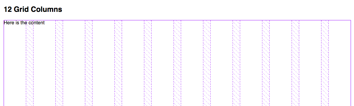
First lets setup the grid column on Figma. Create frame, select frame then go to right panel, find Layout Grid. Click on + (plus) button then change Grid into Column by clicking grid icon 
Now we can see the 12 columns grid set up.
Let’s move to HTML markup. As you can see, I centered column instead of using stretch (default setting) for column setting. Because I want to make maximum width for the container. For now I’m using 1140px maximum width, 24px for gutter and 73px for column width.
<!-- layout.html -->

<div class="wrapper">
  <h2>12 Grid Columns</h2>
  <div class="grid-12">
    <div class="article">
      Here is the content
    </div>
  </div>
</div>
<!-- style.css -->

.wrapper{
  max-width: 1140px;
  margin-left: auto;
  margin-right: auto;
}
.grid-12{
  height: 500px;
  display: grid;

  //-------------------------------------------------------
  // 12 is total columns
  // 1fr: flexible length which represents a fraction of the leftover space in the grid container
  // Source: https://www.w3.org/TR/css3-grid-layout/#fr-unit
  //----------------------------------------------------
  grid-template-columns: repeat(12, 1fr);

  // --------------------------
  // 1.5rem = 24px for gutter.
  // --------------------------
  grid-gap: 1.5rem;
}
.article{
  grid-column: span 6;
}
Here what exactly happened on the browser:
Now lets try to put some content on it.
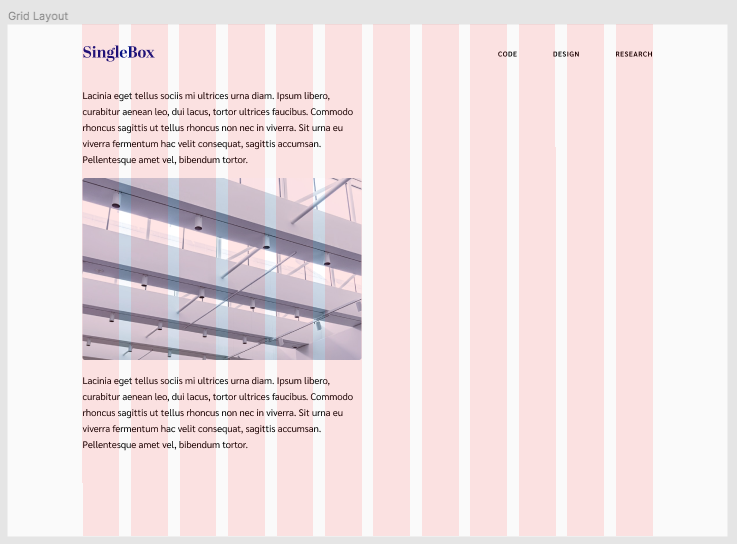
I put extra space on the right for sidebar, we’re going to dive deeper using grid on Figma, we’re going to use Nested Grid. Component on sidebar will have its own grid setting. One thing that you should know is layout setting can only be applied on frame. So you need to create frame for sidebar.
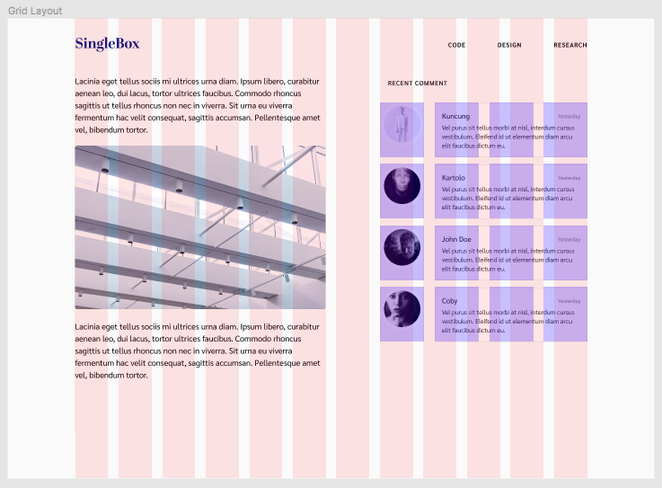
Please see the image above, the blue grid is the new grid inside the parent. It uses 5 columns on parent grid then it’s divided again into 4 columns with 24px gutter.
How this could be on CSS? Check this out.