
Think, write, repeat.
Currently Reading

Shape Up: Stop Running in Circles and Ship Work that Mattersby Ryan Singer, Jason Fried
February 5th, 2020
Create simple input component in Figma x ReactJS
We currently live in the time that design tools become so great, they fill the gap between designer and developer. Developer not only can create user interface exactly like the mockup, but also they can consider to create code that easy to scale and easy to manage.
The methodology like 8pt grid and atomic design can be used in design and development process. The design tools (and the plugins) can do that. So developer and designer will have the same way of thinking, at least almost the same.
I will try to be a designer and developer, and show you how to create the same workflow while I’m using design tool (currently I will use Figma) and React to create simple input component.
Design & Development Process
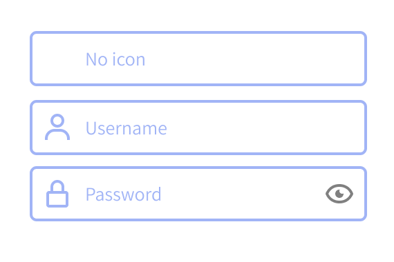
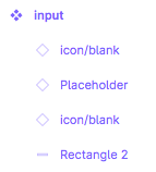
I use atomic design to create the input component, and currently just for input text and password. The input component will have option to add icons. The icons will be placed on the left, right or both.
I’ll try to mimic every step on design process, so it will prove that developer and designer have same way of thinking when creating user interface.
Step One
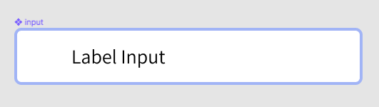
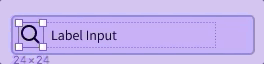
Define the atoms for icons and placeholder. In Figma we called it components. Why we should define placeholder as a component? Just in case we have to change the style of the text.
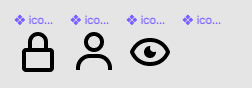
To organized the components that have same category like icon, we should give the name by adding slash “/” after category name. For example “icon/user”. You will see they will be grouped on the assets panel.
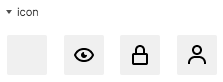
Anyway, as you can see on assets group above, you will see the blank icon there, I put it there because the input will have option to use icon or not.
Now we move to code phase. On React we just need to create the icon component, we don’t create label component because it can be handled by adding props. And here the code of icon component, I named it SVGicon.js
import React from "react";

const getPath = (name, props) => {
  switch (name) {
    case "user":
      return (
        <path
          {...props}
          d="M12 2C9.243 2 7 4.243 7 7s2.243 5 5 5 5-2.243 5-5S14.757 2 12 2zM12 10c-1.654 0-3-1.346-3-3s1.346-3 3-3 3 1.346 3 3S13.654 10 12 10zM21 21v-1c0-3.859-3.141-7-7-7h-4c-3.86 0-7 3.141-7 7v1h2v-1c0-2.757 2.243-5 5-5h4c2.757 0 5 2.243 5 5v1H21z"
        />
      );
    case "lock":
      return (
        <path
          {...props}
          d="M12,2C9.243,2,7,4.243,7,7v3H6c-1.103,0-2,0.897-2,2v8c0,1.103,0.897,2,2,2h12c1.103,0,2-0.897,2-2v-8c0-1.103-0.897-2-2-2 h-1V7C17,4.243,14.757,2,12,2z M18,12l0.002,8H6v-8H18z M9,10V7c0-1.654,1.346-3,3-3s3,1.346,3,3v3H9z"
        />
      );
    case "eye":
      return (
        <path
          {...props}
          d="M11,0 C18.633,0 20.927,6.617 20.949,6.684 L20.949,6.684 L21.054,7 L20.9450416,7.32474737 C20.8490503,7.60172861 18.5057833,14 11,14 C3.367,14 1.073,7.383 1.051,7.316 L1.051,7.316 L0.946,7 L1.052,6.684 C1.073,6.617 3.367,0 11,0 Z M11,2 C5.652,2 3.578,5.842 3.074,7 C3.576,8.154 5.649,12 11,12 C16.348,12 18.422,8.158 18.926,7 C18.424,5.846 16.351,2 11,2 Z M11,4 C11.092,4 11.178,4.02 11.268,4.027 C11.103,4.317 11,4.646 11,5 C11,6.095 11.905,7 13,7 C13.354,7 13.683,6.897 13.973,6.732 C13.98,6.822 14,6.908 14,7 C14,8.642 12.641,10 11,10 C9.358,10 8,8.642 8,7 C8,5.359 9.358,4 11,4 Z"
        />
      );
    default:
      return <path />;
  }
};

const SVGIcon = ({
  name = "",
  style = {},
  fill = "#000",
  width = "24",
  className = "",
  height = "24"
}) => (
  <svg
    width={width}
    style={style}
    height={height}
    className={className}
    xmlns="http://www.w3.org/2000/svg"
    viewBox="0 0 24 24"
    xmlnsXlink="http://www.w3.org/1999/xlink"
  >
    {getPath(name, { fill })}
  </svg>
);

export default SVGIcon;
Step two
Define the molecule for input component that contain icons, placeholder and input area. Then you should create component in Figma for it.
Here is the exciting part for creating component in design tools. We use one master component, that can be used over and over without creating the new one and we can override the style by changing the master component style, eg: we change border color of the input of master component into red, the child components will change too. It’s just like on the development process.
Input component has 3 components inside it, there are 2 icons on left and right, and placeholder. Unfortunately I can’t resize component instance. I wish I could, so when I use blank icon, I will set the width into 1px then with the power of auto layout the gap between placeholder and the icon will be changed. I’ve been googling it, some folks have been struggling with it.
Update: We can use auto layout for it and toggle hide/show the icon instance so the gap inside input field will stay the same.
I mentioned about the exciting part before, component instance is one of them. To find component instance setting, you can find it on right menu on Design tab by selecting the icon component first.
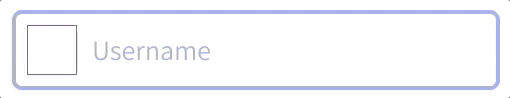
Base color for the icon is black, we still can change it by overriding the master component style. This is why I love Figma over Sketch, it’s easy to change the style of the component without creating the new one.
Ok let’s move to code process for creating input component. Here is the code:
import React from "react";
import SVGIcon from "./SVGicon";

const Input = ({ type = "text", iconLeft, placeholder, iconRight, value }) => {
  return (
    <div className="input">
      <input
        type={type}
        placeholder={placeholder}
        value={value}
        style={
          iconLeft && iconRight
            ? { padding: "0 40px" }
            : iconLeft
            ? { paddingLeft: "40px" }
            : iconRight && { paddingRight: "40px" }
        }
      />
      {iconLeft && (
        <SVGIcon className="iconLeft" name={iconLeft} fill="rgb(55, 53, 214)" />
      )}
      {iconRight && (
        <SVGIcon
          className="iconRight"
          name={iconRight}
          fill="rgb(55, 53, 214)"
        />
      )}
    </div>
  );
};

export default Input;
Unlike design component, input component on React doesn’t have exact props like design has, because we need additional props which is essential for development like value and type of the input. The props iconLeft, iconRight and placeholder is the same props on the design though. I almost forgot it, the fill prop on SVGIcon also the same prop on design when we change color of the icon. So here we are right now on the same path, either you are developer or designer.
On the code we can add logical statement whether we use icon or not, please take a look this part:
style={
  iconLeft && iconRight
    ? { padding: "0 40px" }
    : iconLeft
    ? { paddingLeft: "40px" }
    : iconRight && { paddingRight: "40px" }
}
It will make consistent gap inside the component.
I think that’s it, I try to give my simple shot to encourage designer think like developer does. You can find the full code here.